Select Fieldtype
Give your users a list of options to choose from. This select field is highly configurable with support for search, multiple choice, and creating new options on the fly.
Overview#
This field is highly configurable, thanks to the fantastic Vue Select component. Be sure to explore all the config options!
Data Storage#
Select fields will store the value of the chosen option or options. Given this configuration...
handle: select
field:
display: Select
options:
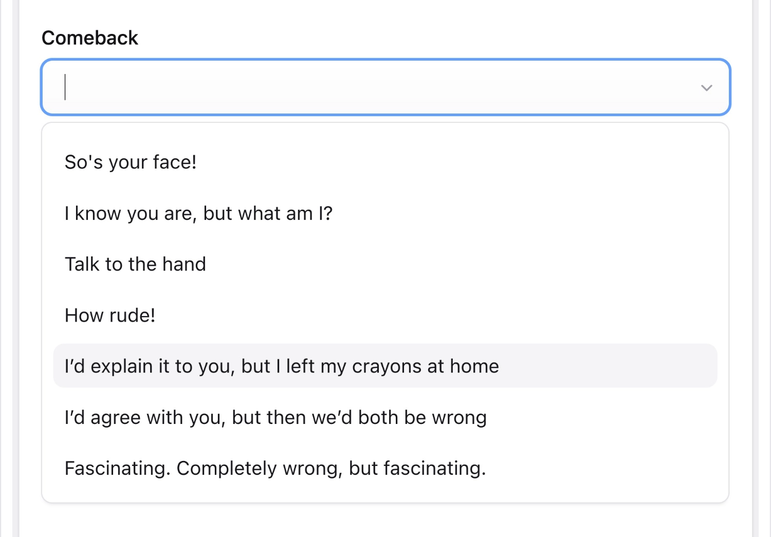
face: "So's your face."
know: "I know you are, but what am I?"
hand: "Talk to the hand."
beeswax: "Mind your own beeswax."
placeholder: 'Choose your snappy comeback'
type: select
Your saved data will be:
select: face
Templating#
Select fields return the value from your selected option. You can access the label with select_var:label.
<p id="{{ select }}"> Oh yeah? {{ select:label }}</p>
<p id="{{ $select }}"> Oh yeah? {{ $select['label'] }}</p>
<p id="face">Oh yeah? So's your face.</p>
Options
clearable
boolean
Allow deselecting any chosen option and making null a possible value. Default: `false`.
options
array
required
A set of key/value pairs that define the values and labels. If you don't define the keys, the value and label will be the same.
placeholder
string
Set the non-selectable placeholder text. Default: none.
default
string
Set the default option key. Default: none.
multiple
boolean
Allow multiple selections. Default: `false`.
searchable
boolean
Enable search with suggestions by typing in the select box. Default: `true`.
taggable
boolean
Use a "tag" style UI when selecting multiples. Default: `false`.
push_tags
boolean
Add newly created options to the list. Default: `false`.